Custom Blocks
Custom blocks let you extend Templatical with your own block types. Define a set of fields, write a Liquid template for rendering, and optionally connect a data source. Users interact with custom blocks through the same drag-and-drop interface as built-in blocks.
Shadow DOM and host-side queries
Custom blocks render inside the editor's Shadow DOM by default. If your custom block needs to be reached from host page code (e.g. to wire up a third-party widget by ID), document.querySelector calls into the editor will not find it — walk the shadow root via container.shadowRoot.querySelector(...) instead, or opt out with shadowDom: false. See the Shadow DOM guide for the full host-integration story.
Defining a custom block
Pass custom block definitions through the editor config. The example below creates a "Testimonial" block with a quote, author details, avatar, and star rating. Once registered, users can drag it from the block palette into their template and edit each field from the settings panel.
import { init } from '@templatical/editor';
const editor = await init({
container: '#editor',
customBlocks: [
{
type: 'testimonial',
name: 'Testimonial',
icon: '<svg viewBox="0 0 24 24" fill="none" stroke="currentColor" stroke-width="2"><path d="M21 15a2 2 0 0 1-2 2H7l-4 4V5a2 2 0 0 1 2-2h14a2 2 0 0 1 2 2z"/></svg>',
description: 'Customer quote with photo and rating',
fields: [
{ key: 'quote', label: 'Quote', type: 'textarea' },
{ key: 'authorName', label: 'Author Name', type: 'text' },
{ key: 'authorTitle', label: 'Author Title', type: 'text' },
{ key: 'avatar', label: 'Avatar', type: 'image' },
{ key: 'rating', label: 'Rating (1-5)', type: 'number', min: 1, max: 5, step: 1, default: 5 },
{ key: 'showRating', label: 'Show Rating', type: 'boolean', default: true },
],
template: `
<table style="width: 100%; font-family: sans-serif;" cellpadding="0" cellspacing="0">
<tr>
<td style="padding: 20px; background: #f9fafb; border-radius: 8px;">
{% if showRating %}
<p style="margin: 0 0 12px; font-size: 18px; letter-spacing: 2px;">
{% if rating >= 1 %}★{% else %}☆{% endif %}
{% if rating >= 2 %}★{% else %}☆{% endif %}
{% if rating >= 3 %}★{% else %}☆{% endif %}
{% if rating >= 4 %}★{% else %}☆{% endif %}
{% if rating >= 5 %}★{% else %}☆{% endif %}
</p>
{% endif %}
<p style="margin: 0 0 16px; font-size: 16px; font-style: italic;
color: #333; line-height: 1.5;">"{{ quote }}"</p>
<table cellpadding="0" cellspacing="0">
<tr>
{% if avatar %}
<td style="vertical-align: middle; padding-right: 12px;">
<img src="{{ avatar }}" width="40" height="40"
style="border-radius: 50%; display: block;"
alt="{{ authorName }}" />
</td>
{% endif %}
<td style="vertical-align: middle;">
<p style="margin: 0; font-weight: 600; font-size: 14px;">
{{ authorName }}
</p>
{% if authorTitle %}
<p style="margin: 2px 0 0; font-size: 13px; color: #666;">
{{ authorTitle }}
</p>
{% endif %}
</td>
</tr>
</table>
</td>
</tr>
</table>
`,
},
],
});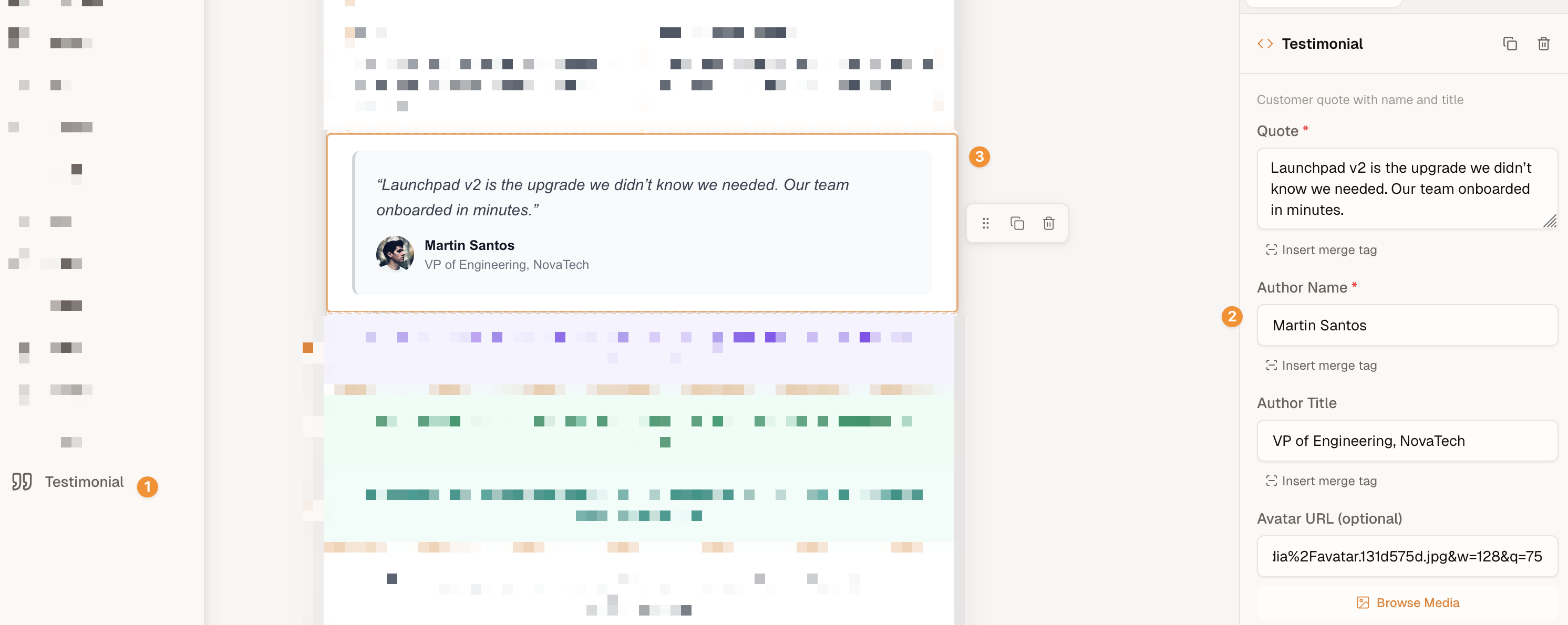
- Block palette — The
nameandiconappear here. Users drag the block from the palette into their template. - Settings panel — Each entry in
fieldsbecomes a form control where users can edit the block's content. - Editor canvas — The Liquid
templaterenders exactly as defined, with field values populated from the settings panel.
Reordering the palette
By default a custom block appears in the palette after all built-in blocks. To promote it — or to hide built-in types you don't use — pass the paletteBlocks option and reference your custom block by its custom:-prefixed type (e.g. "custom:testimonial").
CustomBlockDefinition
interface CustomBlockDefinition {
  type: string;
  name: string;
  icon?: string;
  description?: string;
  fields: CustomBlockField[];
  template: string;
  dataSource?: DataSourceConfig;
  defaultStyles?: Partial<BlockStyles>;
  stylesheet?: string;
}| Property | Required | Description |
|---|---|---|
type | Yes | Unique identifier (used as customType on block instances) |
name | Yes | Display name in the block palette |
icon | No | Inline SVG string, image URL, or base64 data URI for the palette icon |
description | No | Tooltip or subtitle in the palette |
fields | Yes | Array of field definitions |
template | Yes | Liquid template string for rendering |
dataSource | No | External data fetching configuration |
defaultStyles | No | Default block styles (padding, backgroundColor) — see Default styles |
stylesheet | No | Definition-level CSS emitted once into the rendered MJML's <mj-head> and mirrored in the editor canvas — see Stylesheets |
Field types
Each field defines a form control in the block settings panel.
interface CustomBlockFieldBase {
  key: string;
  label: string;
  required?: boolean;
  placeholder?: string;
  readOnly?: boolean;
}
All field types extend this base. The key is used as the variable name in your Liquid template. Additional properties depend on the field type:
| Property | Applies to | Description |
|---|---|---|
required | All | Mark the field as required |
placeholder | All | Placeholder text for the input |
readOnly | All | Prevent user editing (useful with data sources) |
default | All | Default value when the block is created |
min, max, step | number | Numeric constraints |
options | select | Array of { label, value } choices |
fields | repeatable | Sub-field definitions |
minItems, maxItems | repeatable | Item count bounds |
text
Single-line text input.
{
  key: 'title',
  label: 'Title',
  type: 'text',
  default: 'Untitled',
}
textarea
Multi-line text input for longer content.
{
  key: 'body',
  label: 'Body Text',
  type: 'textarea',
}
image
Image URL input with upload/browse integration.
{
  key: 'heroImage',
  label: 'Hero Image',
  type: 'image',
}
color
Color picker input.
{
  key: 'accentColor',
  label: 'Accent Color',
  type: 'color',
  default: '#6366f1',
}
number
Numeric input with optional min, max, and step constraints.
{
  key: 'rating',
  label: 'Rating',
  type: 'number',
  min: 1,
  max: 5,
  step: 1,
}
select
Dropdown with predefined options.
{
  key: 'size',
  label: 'Size',
  type: 'select',
  options: [
    { label: 'Small', value: 'sm' },
    { label: 'Medium', value: 'md' },
    { label: 'Large', value: 'lg' },
  ],
  default: 'md',
}
boolean
Toggle switch.
{
  key: 'showBadge',
  label: 'Show Badge',
  type: 'boolean',
  default: true,
}
repeatable
A repeatable group of sub-fields. Users can add or remove items within the configured bounds. Each entry in fields follows the same field configuration as top-level fields. Nested repeatables are not supported.
{
  key: 'features',
  label: 'Features',
  type: 'repeatable',
  minItems: 1,
  maxItems: 5,
  fields: [
    { key: 'icon', label: 'Icon', type: 'image' },
    { key: 'text', label: 'Text', type: 'text' },
  ],
}
Default styles
Use defaultStyles to declare the block's default padding and backgroundColor alongside the rest of the definition. The value is a Partial<BlockStyles> — specify only the fields you want to override; everything else falls back to the built-in defaults (10px padding all around, no background).
{
  type: 'pricing-table',
  name: 'Pricing Table',
  fields: [...],
  template: '<table>…</table>',
  defaultStyles: {
    padding: { top: 0, right: 0, bottom: 0, left: 0 },
  },
}
defaultStyles applies the moment a user drags the block from the palette onto the canvas. Users can still adjust padding/background per block instance through the block settings — defaultStyles only controls where each new instance starts.
This is the recommended way to opt custom blocks out of the SDK's default wrapper padding when the block's Liquid template already manages its own spacing (e.g. hero sections, product cards, or anything authored as full table HTML).
Existing blocks don't retroactively pick up defaultStyles changes
defaultStyles is applied once, when a new block instance is created from the palette. Blocks already on the canvas — or in saved templates — keep the styles they were created with. To see a defaultStyles change reflected on an existing block, delete it and drag a fresh instance. This is intentional: it prevents per-instance spacing tweaks made by end-users from being silently overwritten when a developer edits the definition.
Stylesheets
The renderer wraps your template output in an mj-text cell, which means MJML's automatic responsive behavior — column stacking, fluid images, mobile-first padding — applies to the outer layout but does not reach inside your custom block's HTML. A two-column custom block with a <table> layout, for example, needs to opt into its own mobile stacking via a media query.
Use stylesheet on the definition for CSS that should apply to all instances of the block: media queries, hover states, custom-block-specific font declarations, anchor color overrides. The renderer collects every definition's stylesheet from the content tree, dedupes (per customType and again per trimmed content), and emits each unique stylesheet once as <mj-style> inside <mj-head> — regardless of how many instances of the block the template contains. The editor canvas mirrors the same CSS so authored responsive behavior previews live.
{
  type: 'image-text',
  name: 'Image + Text',
  fields: [
    { key: 'image', type: 'image', label: 'Image' },
    { key: 'heading', type: 'text', label: 'Heading' },
    { key: 'body', type: 'textarea', label: 'Body' },
  ],
  template: `
    <table role="presentation" cellpadding="0" cellspacing="0" border="0" width="100%">
      <tr>
        <td class="tplc-image-text-cell tplc-image-text-cell--media" style="width: 40%; vertical-align: top;">
          <img src="{{ image }}" width="200" style="display: block; max-width: 100%;" />
        </td>
        <td class="tplc-image-text-cell tplc-image-text-cell--body" style="width: 60%; padding-left: 20px; vertical-align: top;">
          <h3 style="margin: 0 0 8px;">{{ heading }}</h3>
          <p style="margin: 0;">{{ body }}</p>
        </td>
      </tr>
    </table>
  `,
  stylesheet: `
    @media (max-width: 480px) {
      .tplc-image-text-cell {
        display: block !important;
        width: 100% !important;
        padding-left: 0 !important;
      }
      .tplc-image-text-cell--body {
        padding-top: 16px !important;
      }
    }
  `,
}
Namespace your class names
The SDK does not scope stylesheet selectors automatically. Two definitions that use the same class name will collide in the emitted <mj-head>. Prefix your classes per definition — the tplc-<type>-<element> convention (tplc-image-text-cell, tplc-product-card-button, …) keeps each definition's CSS isolated without runtime work.
Email client caveats apply
Like all CSS in an email, your stylesheet rules are subject to per-client support. Notably, Outlook on Windows (2007–2021, Word rendering engine) ignores @media queries entirely — your block keeps its desktop layout there. That's the expected fallback: Outlook desktop is a desktop client, so retaining the desktop styling is usually the right outcome. Mobile clients (iOS Mail, Apple Mail, Gmail, Outlook mobile) support media queries and apply your responsive rules normally.
Stick to widely-supported CSS for the best results: display, width, padding, background-color, border, simple media queries on max-width. Avoid flex, grid, position, CSS animations, and similar advanced features in email contexts.
Liquid templates
The template property uses Liquid syntax. Field values are available as top-level variables matching their key property. Here are the most common patterns:
Output a variable:
<p>{{ title }}</p>Conditionals:
{% if showBadge %}
  <span>New</span>
{% endif %}

{% if price > 100 %}
  <p>Premium item</p>
{% elsif price > 50 %}
  <p>Mid-range item</p>
{% else %}
  <p>Budget item</p>
{% endif %}
Loops (for repeatable fields):
{% for feature in features %}
  <p>{{ feature.text }}</p>
{% endfor %}
Default values:
<p>{{ title | default: "Untitled" }}</p>String filters:
<p>{{ name | upcase }}</p>
<p>{{ description | truncate: 100 }}</p>
Comparisons: ==, !=, >, <, >=, <=, and, or, contains
For the full syntax reference, see the Liquid documentation.
Data sources
Custom blocks become even more powerful when backed by an API data source. Instead of manually filling in every field, a data source fetches external data and populates the block automatically. When the block is added to the canvas (or when the user triggers a refresh), the onFetch callback is called and the returned data populates the block's field values.
interface DataSourceConfig {
  label: string;
  onFetch: (context: DataSourceFetchContext) => Promise<Record<string, unknown> | null>;
}

interface DataSourceFetchContext {
  fieldValues: Record<string, unknown>;
  blockId: string;
}
The label is displayed on the fetch button in the editor UI. The onFetch callback receives a context object with the block's current fieldValues and blockId. Return the fetched data as an object, or null if the fetch should be skipped.
{
  type: 'product-card',
  name: 'Product Card',
  fields: [
    { key: 'productId', label: 'Product ID', type: 'text', readOnly: true },
    { key: 'imageUrl', label: 'Image', type: 'image', readOnly: true },
    { key: 'name', label: 'Product Name', type: 'text' },
    { key: 'price', label: 'Price', type: 'text' },
  ],
  template: `
    <div style="text-align: center; font-family: sans-serif;">
      <img src="{{ imageUrl }}" alt="{{ name }}" style="max-width: 100%;" />
      <h2 style="margin: 16px 0 8px;">{{ name }}</h2>
      <p style="font-size: 24px; font-weight: bold;">{{ price }}</p>
    </div>
  `,
  dataSource: {
    label: 'Fetch Product',
    // Called when user clicks the "Fetch Product" button in the editor.
    // Use this to open a custom picker, call your API, or load data
    // from any external source. Return an object with keys matching
    // your field definitions to populate the block, or null to cancel.
    onFetch: async ({ fieldValues }) => {
      const product = await showMyProductPicker();
      if (!product) return null;
      return {
        productId: product.id,
        imageUrl: product.image_url,
        name: product.name,
        price: `$${product.price.toFixed(2)}`,
      };
    },
  },
}
The returned object is merged into the block's fieldValues — the keys in the returned object should match the key properties of your field definitions. The block's dataSourceFetched flag is then set to true.
Data is fetched once, not dynamically
Data fetching is a one-time operation to populate the fields from an external source. Once fetched, the values are saved directly into the template like any other field data. The data source is not called dynamically at render time — users can still manually edit the populated values afterward unless the field is marked as readOnly.
More examples
Event card
An event invitation block with a schedule built using repeatable fields:
const eventCard: CustomBlockDefinition = {
type: 'event-card',
name: 'Event Card',
icon: '<svg viewBox="0 0 24 24" fill="none" stroke="currentColor" stroke-width="2"><rect x="3" y="4" width="18" height="18" rx="2"/><line x1="16" y1="2" x2="16" y2="6"/><line x1="8" y1="2" x2="8" y2="6"/><line x1="3" y1="10" x2="21" y2="10"/></svg>',
description: 'Event details with schedule and RSVP',
fields: [
{ key: 'eventName', label: 'Event Name', type: 'text', default: 'Untitled Event' },
{ key: 'date', label: 'Date', type: 'text', default: 'January 1, 2026' },
{ key: 'venue', label: 'Venue', type: 'text' },
{ key: 'venueAddress', label: 'Venue Address', type: 'text' },
{ key: 'accentColor', label: 'Accent Color', type: 'color', default: '#4f46e5' },
{ key: 'rsvpUrl', label: 'RSVP URL', type: 'text' },
{
key: 'schedule',
label: 'Schedule',
type: 'repeatable',
minItems: 1,
maxItems: 10,
fields: [
{ key: 'time', label: 'Time', type: 'text' },
{ key: 'session', label: 'Session', type: 'text' },
],
},
],
template: `
<div style="border-left: 4px solid {{ accentColor }}; padding: 16px 20px; font-family: sans-serif;">
<h2 style="margin: 0 0 4px; font-size: 20px;">{{ eventName }}</h2>
<p style="color: #666; margin: 0 0 12px; font-size: 14px;">{{ date }}{% if venue %} · {{ venue }}{% endif %}</p>
{% if venueAddress %}
<p style="color: #999; margin: 0 0 16px; font-size: 13px;">{{ venueAddress }}</p>
{% endif %}
<table style="width: 100%; border-collapse: collapse; margin-bottom: 16px;">
{% for item in schedule %}
<tr>
<td style="padding: 6px 12px 6px 0; font-size: 13px; color: #666; white-space: nowrap; vertical-align: top;">{{ item.time }}</td>
<td style="padding: 6px 0; font-size: 14px;{% unless forloop.last %} border-bottom: 1px solid #eee;{% endunless %}">{{ item.session }}</td>
</tr>
{% endfor %}
</table>
{% if rsvpUrl %}
<a href="{{ rsvpUrl }}" style="display: inline-block; padding: 10px 24px; background: {{ accentColor }}; color: #fff; text-decoration: none; border-radius: 6px; font-size: 14px;">RSVP Now</a>
{% endif %}
</div>
`,
};Pricing tier
A pricing block with a feature list and CTA button:
const pricingTier: CustomBlockDefinition = {
type: 'pricing-tier',
name: 'Pricing Tier',
icon: '<svg viewBox="0 0 24 24" fill="none" stroke="currentColor" stroke-width="2"><line x1="12" y1="1" x2="12" y2="23"/><path d="M17 5H9.5a3.5 3.5 0 0 0 0 7h5a3.5 3.5 0 0 1 0 7H6"/></svg>',
description: 'Pricing card with features list',
fields: [
{ key: 'planName', label: 'Plan Name', type: 'text', default: 'Pro' },
{ key: 'price', label: 'Price', type: 'text', default: '$29/mo' },
{ key: 'highlighted', label: 'Highlighted', type: 'boolean', default: false },
{ key: 'accentColor', label: 'Accent Color', type: 'color', default: '#4f46e5' },
{ key: 'ctaLabel', label: 'Button Label', type: 'text', default: 'Get Started' },
{ key: 'ctaUrl', label: 'Button URL', type: 'text' },
{
key: 'features',
label: 'Features',
type: 'repeatable',
minItems: 1,
maxItems: 8,
fields: [
{ key: 'text', label: 'Feature', type: 'text' },
],
},
],
template: `
<div style="font-family: sans-serif; border: {% if highlighted %}2px solid {{ accentColor }}{% else %}1px solid #e5e7eb{% endif %}; border-radius: 8px; padding: 24px; text-align: center;">
<h3 style="margin: 0 0 4px; font-size: 18px;">{{ planName }}</h3>
<p style="font-size: 32px; font-weight: bold; margin: 8px 0 16px;">{{ price }}</p>
<table style="width: 100%; text-align: left; margin-bottom: 20px;">
{% for feature in features %}
<tr>
<td style="padding: 6px 0; font-size: 14px; color: #333;">✓ {{ feature.text }}</td>
</tr>
{% endfor %}
</table>
{% if ctaUrl %}
<a href="{{ ctaUrl }}" style="display: inline-block; padding: 10px 24px; background: {{ accentColor }}; color: #fff; text-decoration: none; border-radius: 6px; font-size: 14px;">{{ ctaLabel }}</a>
{% endif %}
</div>
`,
};Email compatibility tips
Custom block templates are rendered as raw HTML inside the email. Keep these guidelines in mind:
- Use inline styles -- Email clients strip
<style>blocks. Put all styling instyleattributes. - Use tables for layout -- Flexbox and CSS Grid don't work in most email clients (especially Outlook). Use
<table>for side-by-side layouts. - Avoid complex CSS -- No
position,float,display: flex,box-shadow, or CSS animations. Stick topadding,margin,border,background-color,color,font-size, andtext-align. - Test in real clients -- Outlook, Gmail, Apple Mail, and Yahoo all render HTML differently. Use an email testing tool to preview across clients.
Error handling in data sources
The onFetch callback should handle errors gracefully. If the fetch fails, return an empty object or partial data -- the block will render with whatever field values are available:
dataSource: {
  label: 'Fetch Product',
  onFetch: async ({ fieldValues }) => {
    try {
      const res = await fetch(`/api/products/${fieldValues.productId}`);
      if (!res.ok) return null;
      return await res.json();
    } catch {
      return null; // Block renders with existing field values
    }
  },
},