
English
Merge Tags
Merge tags are tokens for dynamic content -- things like a recipient's name, a product price, or an unsubscribe URL. They appear as highlighted tokens in the editor and pass through unchanged in the rendered MJML. Your email sending platform replaces them with real values at send time.
Templatical provides built-in syntax presets for popular platforms and supports custom syntax definitions.
Configuration
Pass a tags array to register your merge tags with the editor. When the editor detects a merge tag value in the content (e.g. {{first_name}}), it replaces it visually with the human-readable label ("First Name") — making the template much easier to read and edit. The raw value is preserved in the output.

Hovering over a tag reveals the raw value behind the label.
The syntax property is optional and defaults to 'liquid'.
ts
import { init } from '@templatical/editor';

const editor = await init({
  container: '#editor',
  mergeTags: {
    tags: [
      { label: 'First Name', value: '{{first_name}}' },
      { label: 'Last Name', value: '{{last_name}}' },
      { label: 'Email', value: '{{email}}' },
      { label: 'Company', value: '{{company.name}}' },
      { label: 'Unsubscribe URL', value: '{{unsubscribe_url}}' },
    ],
  },
});MergeTag type
Each tag is defined with a label (shown in the editor UI) and a value (the full merge tag string including delimiters). Two optional fields — group and description — are used by the built-in picker to organize and explain tags:
ts
interface MergeTag {
  label: string;
  value: string;
  group?: string;        // optional grouping shown in the picker
  description?: string;  // optional helper text shown in the picker
  sample?: string;       // optional example value shown in previews
}
The value must include the syntax delimiters. For example, with Liquid syntax:
value: '{{first_name}}'
The group and description fields are picker-only — they do not appear in the editor canvas, in autocomplete, or in the rendered MJML output. They are ignored if you only use onRequest for tag selection.
Sample values
A tag can carry a sample — an example value that preview surfaces render in its place, so a preview reads like a delivered email instead of a list of field names:
ts
mergeTags: {
  tags: [
    { label: 'First Name', value: '{{first_name}}', sample: 'Ada' },
    { label: 'Plan', value: '{{plan_name}}', sample: 'Pro' },
  ],
}Setting sample is the whole opt-in — there is no flag to enable alongside it. The value never leaves the preview: it is not written to the template, not returned by getContent(), not sent, and not present in MJML output. It also shows in the built-in picker, so an author can see what a tag will render before inserting it.
How previews use it — the Sample / Label switch, which tags keep their highlight, and what happens on the editing canvas — is covered in Preview Rendering. That page also documents resolvePreview, the hook for having your own backend resolve a preview, which is the only way to evaluate logic tags.
Syntax presets
Templatical includes four built-in syntax presets. The syntax setting tells the editor how to detect and highlight both data tags and logic tags in content.
Each preset defines two patterns:
- Data tags -- variable merge tags like a recipient's name or email
- Logic tags -- control flow statements like conditionals and loops
| Preset | Data tag | Logic tag | Platform |
|---|---|---|---|
'liquid' | {{first_name}} | {% if vip %} | Shopify, Jekyll, Django, Jinja2 |
'handlebars' | {{first_name}} | {{#if vip}} | Handlebars.js, Mandrill |
'mailchimp' | *|FIRST_NAME|* | *|IF:VIP|* | Mailchimp |
'ampscript' | %%=first_name=%% | %%[IF @vip]%% | Salesforce Marketing Cloud |
ts
mergeTags: {
  syntax: 'handlebars',
  tags: [
    { label: 'First Name', value: '{{first_name}}' },
  ],
}
Logic tag highlighting
Beyond data tags, the editor also recognizes logic tags -- conditional statements, loops, and other control flow syntax used by your email platform. These are detected automatically using the logic regex pattern from the selected syntax preset.
When a logic tag is detected in content, the editor extracts the keyword (the first capture group from the logic regex) and displays it as an uppercase badge -- for example, {% if customer.vip %} renders as IF and {% endif %} renders as ENDIF. Hovering over the badge shows the full tag value as a tooltip. Users can click the badge to edit the raw value.
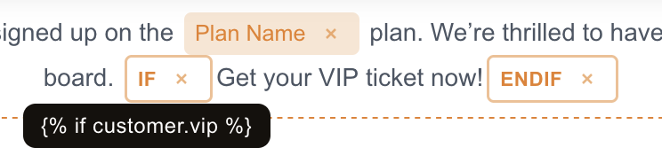
Logic tags are styled differently from data tags (outlined badge with primary color vs filled background) so template authors can distinguish between data tags and control flow at a glance.
Like data tags, logic tags pass through unchanged in the rendered MJML — your sending platform evaluates them at send time.
Inserting logic tags
This section covers highlighting — any logic tag you type or paste is detected automatically. To let users insert logic tags without typing them (a dedicated Logic button, condition/loop blocks that wrap a selection), see the separate Logic Tags guide. Logic is configured independently of merge tags.
Examples of logic tags by preset:
html
{% if customer.vip %}
  <p>Exclusive offer just for you!</p>
{% endif %}

{% for item in cart.items %}
  <p>{{item.name}} - {{item.price}}</p>
{% endfor %}
html
{{#if hasSubscription}}
  <p>Your plan renews on {{renewal_date}}</p>
{{/if}}

{{#each products}}
  <p>{{this.name}}</p>
{{/each}}
html
*|IF:VIP|*
  <p>VIP discount applied</p>
*|END:IF|*
html
%%[IF @subscriber_type == "premium"]%%
  <p>Premium content here</p>
%%[ENDIF]%%Custom syntax
If the built-in presets don't match your platform, define a custom syntax with two regex patterns -- one for data tags and one for logic tags:
ts
interface SyntaxPreset {
  value: RegExp;  // matches data tags like ${user.name}
  logic: RegExp;  // matches logic tags like $[IF ...]
}
Example for a ${...} / $[...] syntax:
ts
mergeTags: {
  syntax: {
    value: /\$\{.+?\}/g,
    logic: /\$\[\s*(\w+).*?\]/g,
  },
  tags: [
    { label: 'User Name', value: '${user.name}' },
    { label: 'Order Total', value: '${order.total}' },
  ],
}
The value regex detects data tags. The logic regex detects control flow statements — the first capture group (\w+) extracts the keyword (e.g., IF, FOR) which the editor uses as the display label.
Autocomplete
When users type the syntax opener (e.g. {{ for Liquid/Handlebars, *| for Mailchimp, %%= for AMPscript), the editor surfaces a popup listing matching tags from the configured tags array. Selecting an item (mouse click, Enter, or Tab) inserts it as a merge tag — the same form produced by the toolbar picker. Esc or clicking elsewhere dismisses the popup.
Autocomplete works both inside title/paragraph rich-text blocks and in every merge-tag-enabled input and textarea field (button and image URLs, image alt text, video and menu links, the rich-text link dialog's URL field, template settings, and custom-block text fields). The popup, filtering, keyboard navigation, and positioning are identical across both surfaces.
Filtering is case-insensitive and matches against both label and value. The list is capped at 10 results.
Autocomplete is enabled by default. It is automatically disabled when:
tagsis empty (no candidates to suggest), orsyntaxis a custom regex (the editor cannot infer a trigger string from arbitrary regexes).
To opt out explicitly, set autocomplete: false:
ts
const editor = await init({
  container: '#editor',
  mergeTags: {
    autocomplete: false,
    tags: [
      { label: 'First Name', value: '{{first_name}}' },
    ],
  },
});
The toolbar's Merge tag button continues to work regardless of the autocomplete setting.
Built-in picker
When you configure mergeTags.tags without an onRequest callback, clicking the Merge tag button in the rich text toolbar (or next to a sidebar text input) opens a built-in modal picker. The picker lists every tag from tags, supports keyboard navigation, and offers a search field that matches against label, value, and description.
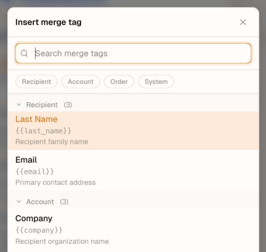
The picker shows:
- the label (bold)
- the raw value (mono, dim)
- the optional description (small, dim) when set
When at least one tag carries a group field, the picker renders sectioned headers in insertion order (the order tags appear in your tags array). Tags without group fall under a localized "Other" header. When no tag has a group, the picker renders a plain flat list — no headers, no "Other" bucket.
Typing in the search field flattens groups and filters the list. Case-insensitive substring matches against the tag's label, value, or description. Clearing the search restores the grouped (or flat) layout.
Single-step insert: clicking a row, or pressing Enter on the highlighted row, inserts the tag and closes the modal. Esc, the header close (×), or clicking the backdrop all dismiss the picker without inserting.
ts
const editor = await init({
  container: '#editor',
  mergeTags: {
    tags: [
      {
        label: 'First Name',
        value: '{{first_name}}',
        group: 'Recipient',
        description: 'Personalized greeting',
      },
      {
        label: 'Last Name',
        value: '{{last_name}}',
        group: 'Recipient'
      },
      {
        label: 'Company',
        value: '{{company.name}}',
        group: 'Account'
      },
      {
        label: 'Unsubscribe URL',
        value: '{{unsubscribe_url}}',
        description: 'Required by anti-spam legislation',
      },
    ],
  },
});
Dynamic tag loading
For large or context-dependent tag lists, use the onRequest callback instead of (or in addition to) a static tags array. The editor calls this function when the user clicks to insert a merge tag. Use it to open a custom picker modal, fetch available merge tags from your API, or build a context-aware tag list based on the current user. Return the selected MergeTag or null to cancel.
ts
const editor = await init({
  container: '#editor',
  mergeTags: {
    onRequest: async () => {
      const tag = await showMyMergeTagPicker();
      return tag; // MergeTag or null if cancelled
    },
  },
});Precedence
If you provide both tags and onRequest, onRequest takes precedence — the Merge tag button always calls your callback. The static tags array still powers the typing-autocomplete suggestion list.
Changing a tag that is already in the content
Activating a tag in the content — clicking it, or pressing Enter on it — reopens the chooser so the author picks a different tag. It is the same chooser insertion uses, called with a context that says which job it is doing:
ts
const editor = await init({
  container: '#editor',
  mergeTags: {
    onRequest: async (context) => {
      // context: { reason: 'insert' | 'edit', current?: MergeTag }
      return showMyMergeTagPicker({ preselect: context?.current });
    },
  },
});
The parameter is optional, so a callback that ignores it keeps working unchanged.
Which route an activated tag takes depends on what can resolve its token:
| Configuration | Activating a tag opens |
|---|---|
onRequest is set | your chooser, always — context.current is the resolved tag, or absent for a token that matches no entry in tags |
only tags is set, and the token matches one | the built-in picker, with that tag preselected |
| the token matches nothing, or neither is configured | a text input holding the raw token |
The last row is the only place a token is editable as text, and it exists so a legacy or mistyped token can still be repaired. Input there is checked against your syntax — a value that is not a merge tag is never committed, because it would otherwise be written into the sent email verbatim.
Hiding the raw token
A tag's tooltip shows the token behind its label. That suits a readable syntax like {{first_name}}, where the token tells an author which field they are looking at. When value is an internal identifier your backend resolves, set showRawValue: false:
ts
const editor = await init({
  container: '#editor',
  mergeTags: {
    showRawValue: false,
    onRequest: async () => showMyFieldPicker(),
  },
});
Authors then see only labels — on the canvas, in sidebar fields and in the built-in picker. Display-only: the token is unchanged in stored content and in the rendered output.
It also governs what a tag renders as, not only its tooltip. A tag resolves its display label in this order:
- the
labelof the matching entry intags; - the label stored on the tag when it was inserted or last changed;
- the token itself — or, with
showRawValue: false, a neutral placeholder.
Step 2 is what keeps a tag your onRequest minted readable: it is in no tags array, so only the label you returned identifies it. For a tag the editor made itself — typed, pasted, or converted from loaded content — the stored label is the token, so the two steps agree and nothing changes.
Sidebar fields
A field value is a single string that mixes text and tokens (Hi {{first_name}}, welcome). Its tags are individually clickable and re-picked like any other. To change the text around them, use Edit as text — or click anywhere else in the field — which opens the whole string, tokens included. showRawValue does not change that.
Changing the tag list after init()
editor.setMergeTags(tags) replaces the configured list at runtime:
ts
const editor = await init({
  container: '#editor',
  mergeTags: { tags: initialTags },
});

// A tag was renamed, or your picker minted a new one.
editor.setMergeTags(nextTags);
Everything that renders a tag reads the same list, so the canvas, the sidebar fields and the built-in picker repaint together. It is available on initCloud() too.
Mutating the array does not work
Pushing into the array you passed to init() is not supported. It never repaints anything already on screen — only tags rendered after the push pick up the change. Call setMergeTags instead.
Autocomplete has one limit
Whether type-ahead is active is decided when a block opens for editing. Going from no tags to some enables it for the next block opened, not for one already being edited. Everything else — labels, the Insert merge tag control, the picker — updates immediately.
Tokens in loaded content
Content that never passed through the editor — a template from your own store, or one produced by the @templatical/import-* converters — carries merge tags as bare {{tokens}} rather than as tag nodes. The editor converts them on the way in, so a loaded tag behaves exactly like a typed one: human label, highlight, sample, and selectable as a single unit.
There is nothing to call and nothing to enable. It runs wherever content arrives:
| Path | When |
|---|---|
init({ content }) / initCloud({ content }) | before mount |
editor.setContent(content) | before the content reaches the canvas |
editor.create({ content }) | before the content becomes editor state |
editor.load(id) | as the templates provider's result returns |
| Version history preview and restore | as each version reaches the canvas |
Matching follows your configured syntax, not the tags array, so an undeclared token still becomes a tag — labelled with its own raw value.
Only text is converted. A token in an href, src or any other attribute is left byte-identical:
html
<!-- in -->
<p>Hi {{first_name}} — <a href="{{unsubscribe_url}}">unsubscribe</a></p>

<!-- out -->
<p>Hi <span data-merge-tag="{{first_name}}">First Name</span> —
   <a href="{{unsubscribe_url}}">unsubscribe</a></p>
Only rich text is converted — TitleBlock.content and ParagraphBlock.content. Every other merge-tag-bearing field is rendered as text and keeps its bare tokens: button text and URLs, image src/alt, HtmlBlock.content, custom-block field values, settings.preheaderText, and table cells.
getContent() is not a byte-for-byte round-trip
A loaded template's bare tokens come back as tag nodes. Nothing is written to your store unless you save, and nothing is marked as an unsaved change — but expect a one-time difference if you diff or checksum stored templates.
Output is unaffected: toMjml() / toHtml() replace a tag node with its token, so a converted template and its bare-token original compile identically.
Writing a resolvePreview hook
Your resolvePreview callback receives tag nodes, including for content that arrived as bare tokens. Match on the tag markup, not the raw token — a naive replaceAll('{{first_name}}', 'Grace') also hits the token inside data-merge-tag="{{first_name}}" and silently produces a tag that renders its label.
Merge tags in other inputs
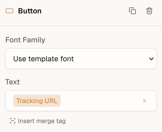
Merge tags aren't limited to title and paragraph blocks. The editor detects and highlights merge tags in other block inputs too — button text, button URL, image URL, image alt text, and link href values. The same label replacement and tooltip behavior applies in these fields.
Link URLs
The Insert Link dialog in a title or paragraph block takes merge tags in its URL field, through the same insert button, picker and autocomplete as every other URL field. A link is often per-recipient or per-event, so its URL is frequently a tag rather than a literal.
A URL you type without a scheme is completed with https:// — except when it opens with a merge tag, which is stored exactly as written:
text
you type                         stored href
──────────────────────────────   ──────────────────────────────
{{event_url}}                 →  {{event_url}}
{{base_url}}/events/42        →  {{base_url}}/events/42
https://acme.com/{{event_id}} →  https://acme.com/{{event_id}}
acme.com/promo                →  https://acme.com/promo
The tag supplies its own scheme, so prefixing one would produce https://https://…. The scheme allowlist still runs first, so a tag cannot smuggle a rejected scheme (javascript:, data:) past it.
A tag in an href is left byte-identical on export — see Tokens in loaded content — so the sending system resolves it, exactly as it does in a button URL.
Using merge tags outside the editor
The editor handles merge tags on every surface it owns — rich-text blocks, the toolbar picker, and the other block inputs above. For inputs outside the editor, such as an email subject field in your own app, build a small field of your own using the merge-tag primitives that @templatical/types exports. These are the same functions the editor uses internally, so your field stays consistent with whatever syntax you configured the editor with.
The package (MIT) exports the full toolkit:
SYNTAX_PRESETS— the built-in syntax definitions (liquid,handlebars,mailchimp,ampscript)getSyntaxTriggerChar/getSyntaxClosingChar— a preset's opening/closing delimiters, for autocomplete detectionisMergeTagValue,getMergeTagLabel,containsMergeTag— matching and label resolutionisLogicMergeTagValue,getLogicMergeTagKeyword— the same for logic tags- the
MergeTagandSyntaxPresettypes
Render a stored value as labeled chips
Split a raw string into plain text and resolved tag labels — essentially the editor's own segmentation:
ts
import { SYNTAX_PRESETS, getMergeTagLabel, type MergeTag } from '@templatical/types';

const syntax = SYNTAX_PRESETS.liquid;
const tags: MergeTag[] = [{ label: 'First name', value: '{{first_name}}' }];

function segments(value: string) {
  const re = new RegExp(syntax.value.source, 'g');
  const out: { text: string; isTag: boolean; label?: string }[] = [];
  let last = 0;
  let m: RegExpExecArray | null;
  while ((m = re.exec(value))) {
    if (m.index > last) out.push({ text: value.slice(last, m.index), isTag: false });
    out.push({ text: m[0], isTag: true, label: getMergeTagLabel(m[0], tags) });
    last = m.index + m[0].length;
  }
  if (last < value.length) out.push({ text: value.slice(last), isTag: false });
  return out;
}

// segments('Hi {{first_name}}!') →
//   [ { text: 'Hi ', isTag: false },
//     { text: '{{first_name}}', isTag: true, label: 'First name' },
//     { text: '!', isTag: false } ]
Autocomplete on a plain input
The delimiter helpers keep your own dropdown syntax-accurate across every preset:
ts
import { SYNTAX_PRESETS, getSyntaxTriggerChar, getSyntaxClosingChar } from '@templatical/types';

const syntax = SYNTAX_PRESETS.liquid;
const open = getSyntaxTriggerChar(syntax);   // '{{'
const close = getSyntaxClosingChar(syntax);  // '}}'

// On each keystroke, look at the text before the caret: if it contains an
// unclosed `open` delimiter, take the fragment after it as the query and
// filter your tags into a dropdown of your own.
Owning the field means it renders in your framework, styled to your design system, against your own tag model — which for something like a subject line is usually what you want.